

How Many Logos Do You Need?
If you’re looking to enhance your knowledge about branding and logo design, I recommend watching this concise video. It provides valuable insights on determining the number of logos you may require.
https://www.instagram.com/reel/Cu4X7QPgTje/?igshid=MTc4MmM1YmI2Ng%3D%3D
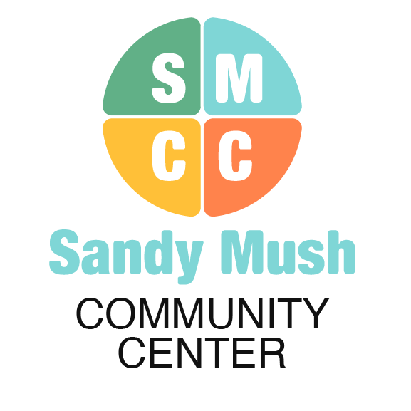
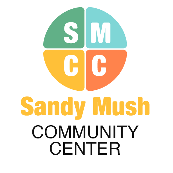
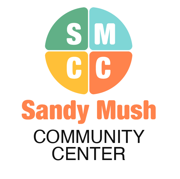
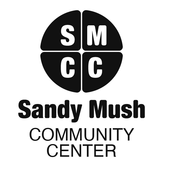
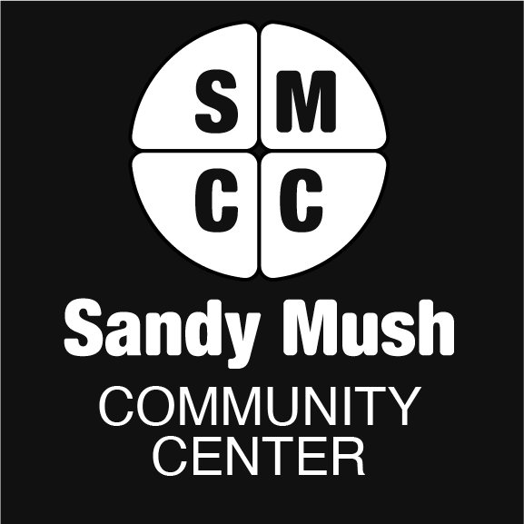
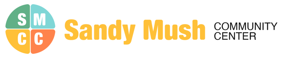
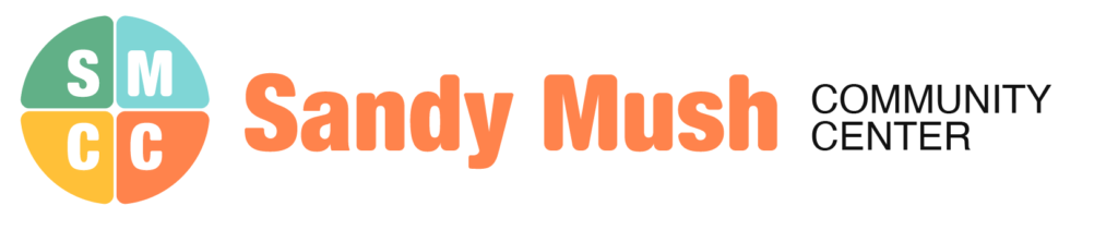
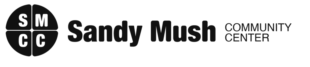
The four parts of the circle in the SMCC logo represent the community from all walks of life. When they come together, they form a unified whole, symbolizing inclusiveness and unity. This design is meant to convey the idea that SMCC is a welcoming and inclusive community that values diversity and collaboration.
The color palette used in the logo can be exchanged among Coral, Green, Gold, and Cornflower Blue to reflect the brand’s personality and values. Additionally, the logo is available in black and white versions with background transparency, providing versatility for various use cases.
The logo is designed in both a horizontal and vertical direction, as well as a single icon that is available in color, black, or white. This provides flexibility for different types of media and promotional materials.
Finally, the Icon with the name wrapped around the circle is also available in color, black, or white, providing a cohesive branding experience.
Overall, the design of this logo emphasizes inclusiveness, versatility, and brand recognition. By using a circle icon and a flexible color palette, this logo is able to convey a strong message of community and unity while remaining adaptable to different use cases and branding needs.


Vertical Logo (four colors, black, and white)
The vertical version of the logo is great for use in situations where you need a taller or more prominent logo. It’s also a good option for use on digital platforms where a taller logo is preferred, such as in a social media profile image or in an email signature.
For example, the vertical logo could be used on a banner, posters, or in the footer of the website. It’s important to note that the vertical logo may not be as legible or recognizable at smaller sizes, so it’s best to use the icon version of the logo in those situations.
Circle Icon (without name)
The icon without the name can be used when you want to create a simpler, more minimalist design or when space is limited, such as on social media profiles or when creating a favicon for the website. It can also be used when you want to create a visual association with our brand in a more subtle way. However, it’s important to note that the full logo with the name should be used in situations where brand recognition is more important, such as on flyers, promotional materials, or when creating a larger marketing campaign.
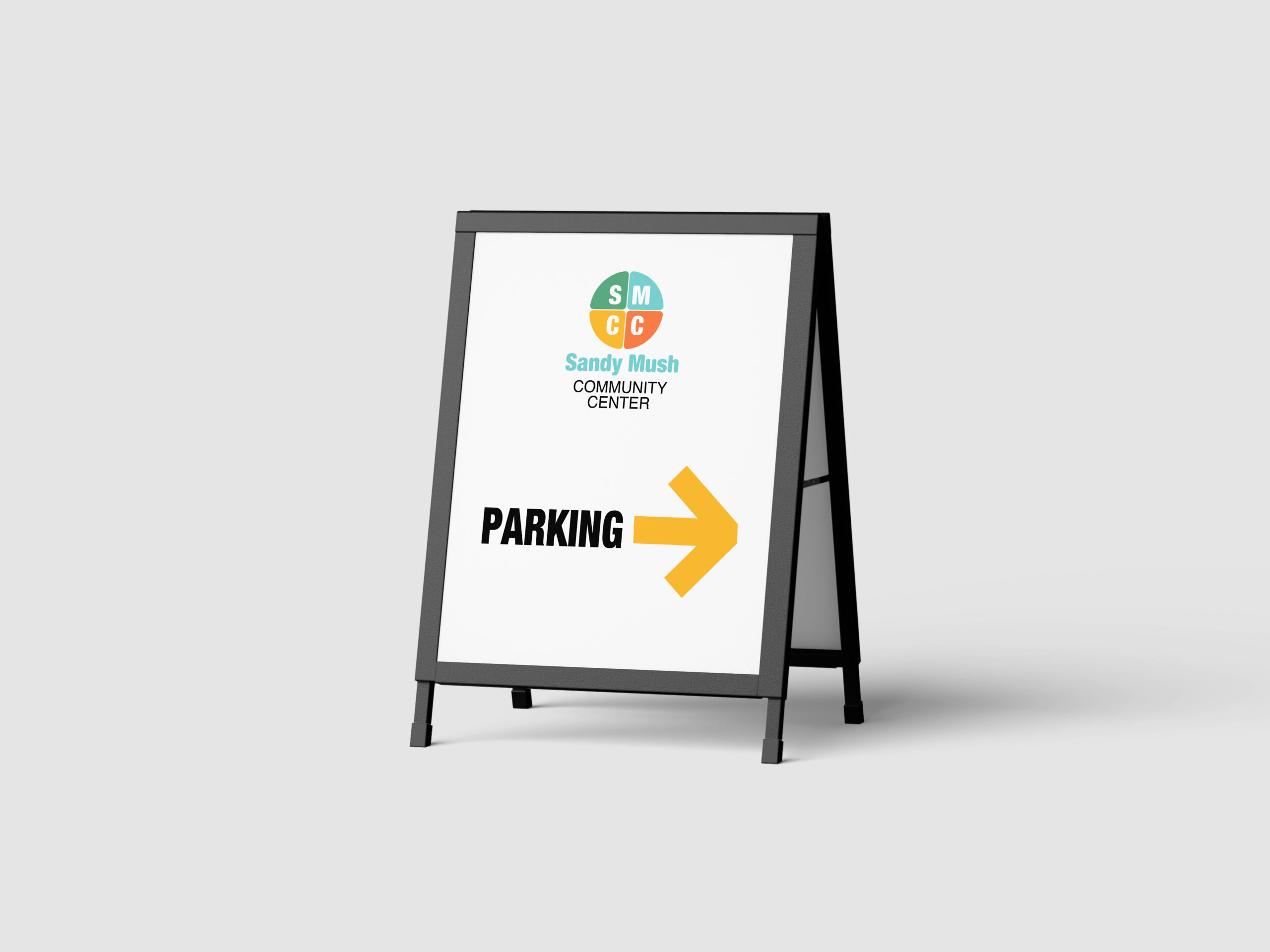
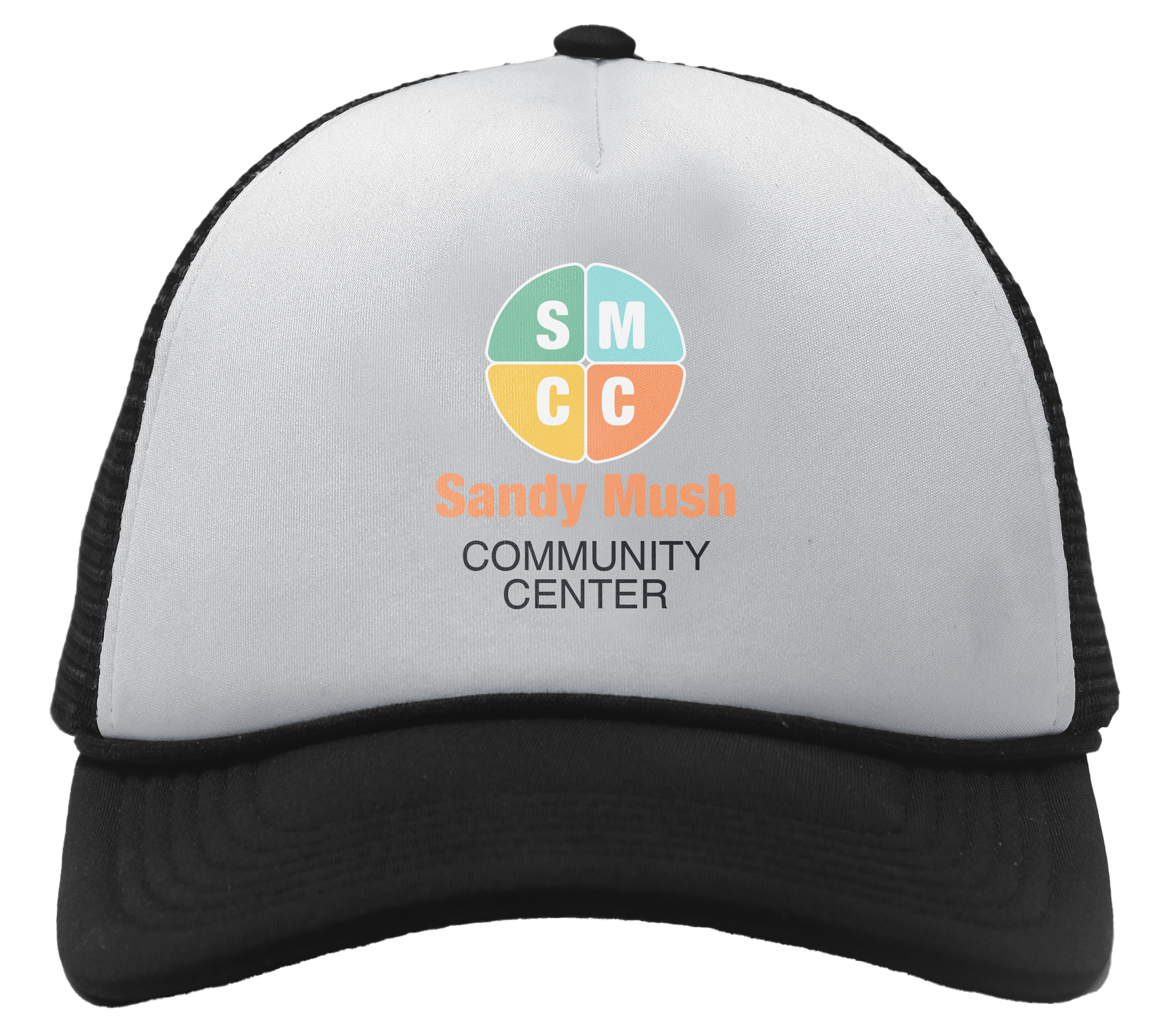
Circle Icon (with name)
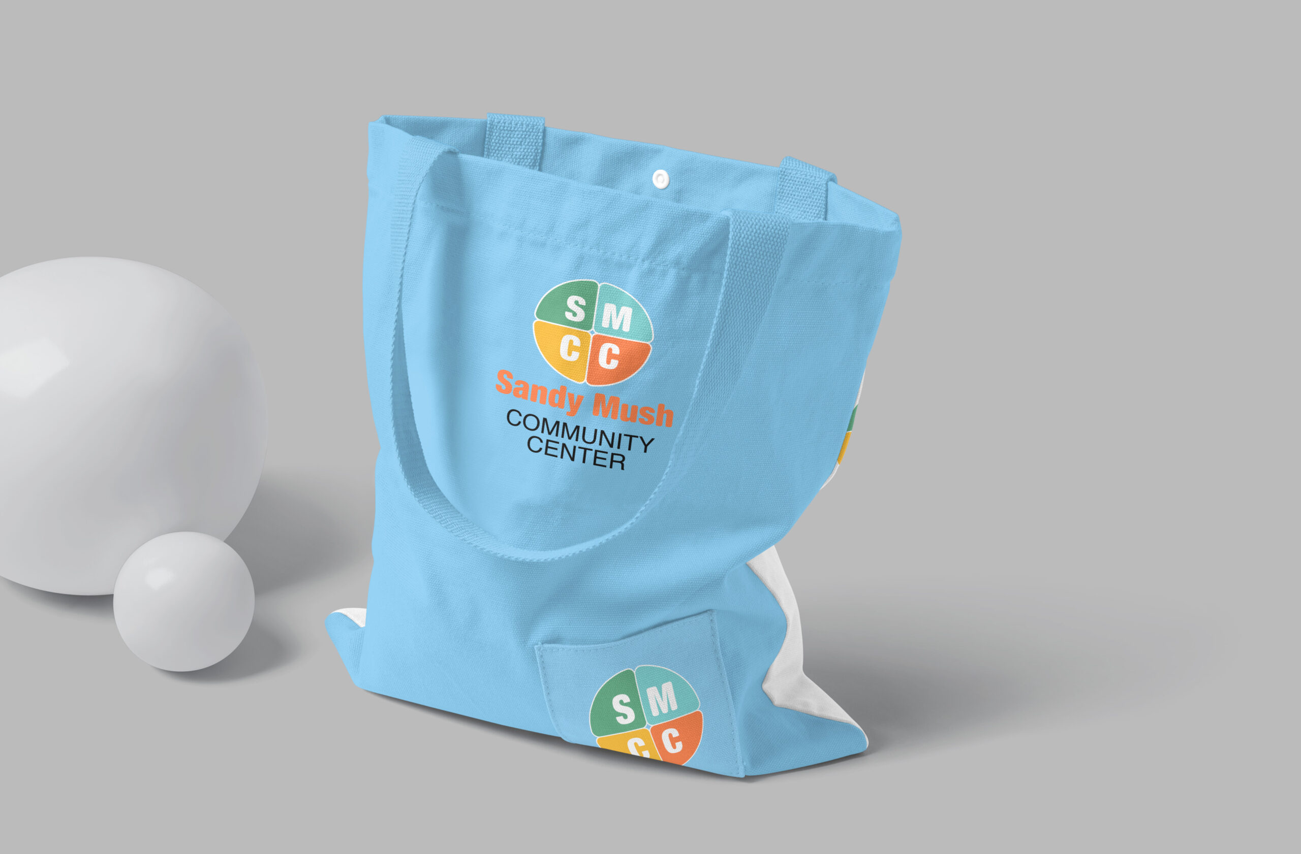
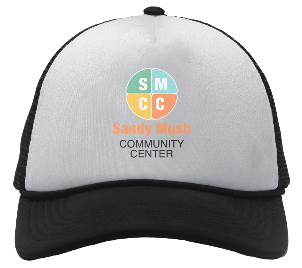
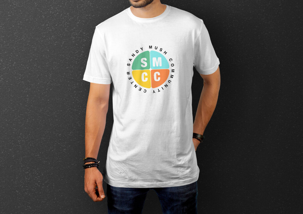
The circle logo with the name wrapped around the icon should be used when brand recognition is a priority. This version of the logo is great for use on promotional materials or when creating a larger marketing campaign. It could also be used on merchandise such as t-shirts or hats, or on signage or other types of physical branding materials. In general, the logo with the name wrapped around the icon is a good option when you want to make sure people are able to easily associate the logo with our brand.
However, if you’re looking to create a simpler or more minimalist design, or if space is limited, the icon without the name may be a better option.
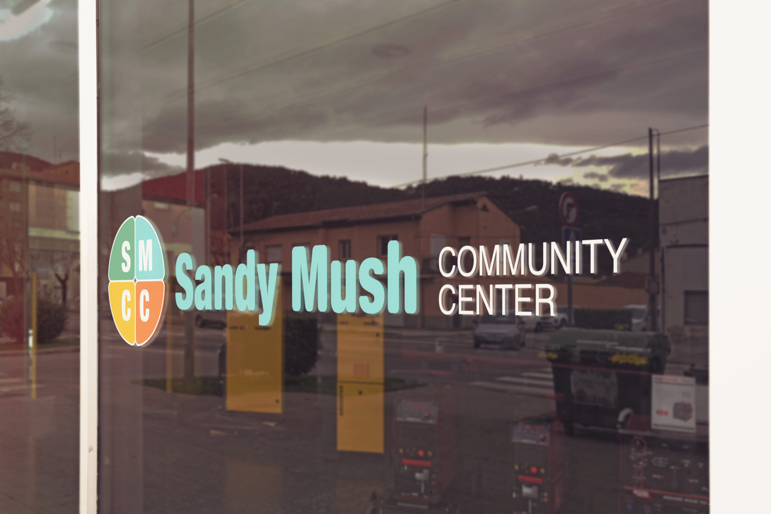
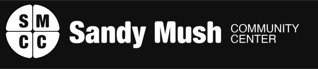
Horizontal Logo (four colors, black, and white)
The larger horizontal version of the logo is great for use in situations where you need a wider or more prominent logo, such as on banners or signs. It’s also a good option for use on websites or other digital platforms where a wider logo is preferred, such as in the header of a website or in a social media banner.
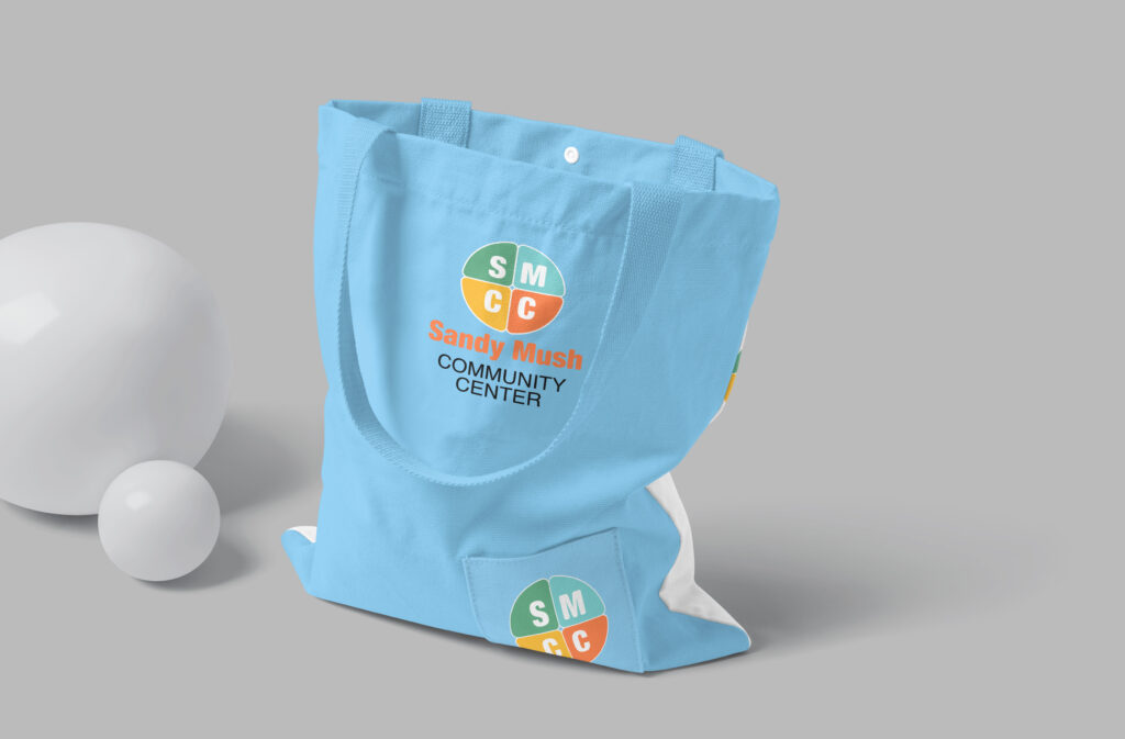
For example, the horizontal logo could be used on a banner at an event, flyers or brochures, or on merchandise such as t-shirts or tote bags. It’s important to note that the horizontal logo may not be as legible or recognizable at smaller sizes, so it’s best to use the vertical or icon versions of the logo in those situations.


Color Variations
The vertical & horizontal versions of the logo are available in four color variants, including Coral, Green, Gold, and Cornflower Blue. The choice of color can be based on the brand’s personality and values. For example, Coral can be used to convey a sense of warmth and approachability, while Green can represent growth and sustainability. Gold can convey sophistication and comfort, while Cornflower Blue can convey a sense of calm and serenity.
When selecting a color for the vertical or horizontal logo, consider the context in which it will be used. For example, if the logo will be used primarily on digital platforms or in situations where space is limited, it may be best to use a color that stands out and is easily recognizable, such as Coral or Green. On the other hand, if the logo will be used on physical branding materials or in situations where a more sophisticated or calming tone is desired, Gold or Cornflower Blue may be a better choice.
It’s important to note that the color palette can be exchanged among the four options, depending on the situation and context. For example, if the logo is being used in a context that requires a more formal or refined tone, Gold may be the best choice, even though our brand’s personality is typically more approachable or casual. Ultimately, the choice of color should be based on the context in which the logo will be used and the message that the brand is trying to convey.
Black & White Versions
The black and white version of the logo can be used in situations where color is not an option, or when a simpler and more minimalist design is desired. It can also be used on materials that will be printed in black and white, such as newspapers or flyers. The black and white version of the logo is available in both the horizontal and vertical versions, as well as the icon with full name version, and the Circle Icon.